
U.S. Department of State Domestic Impact Map
Skills: Research, UX Design, UI Design
Tools: Sketch, InVision
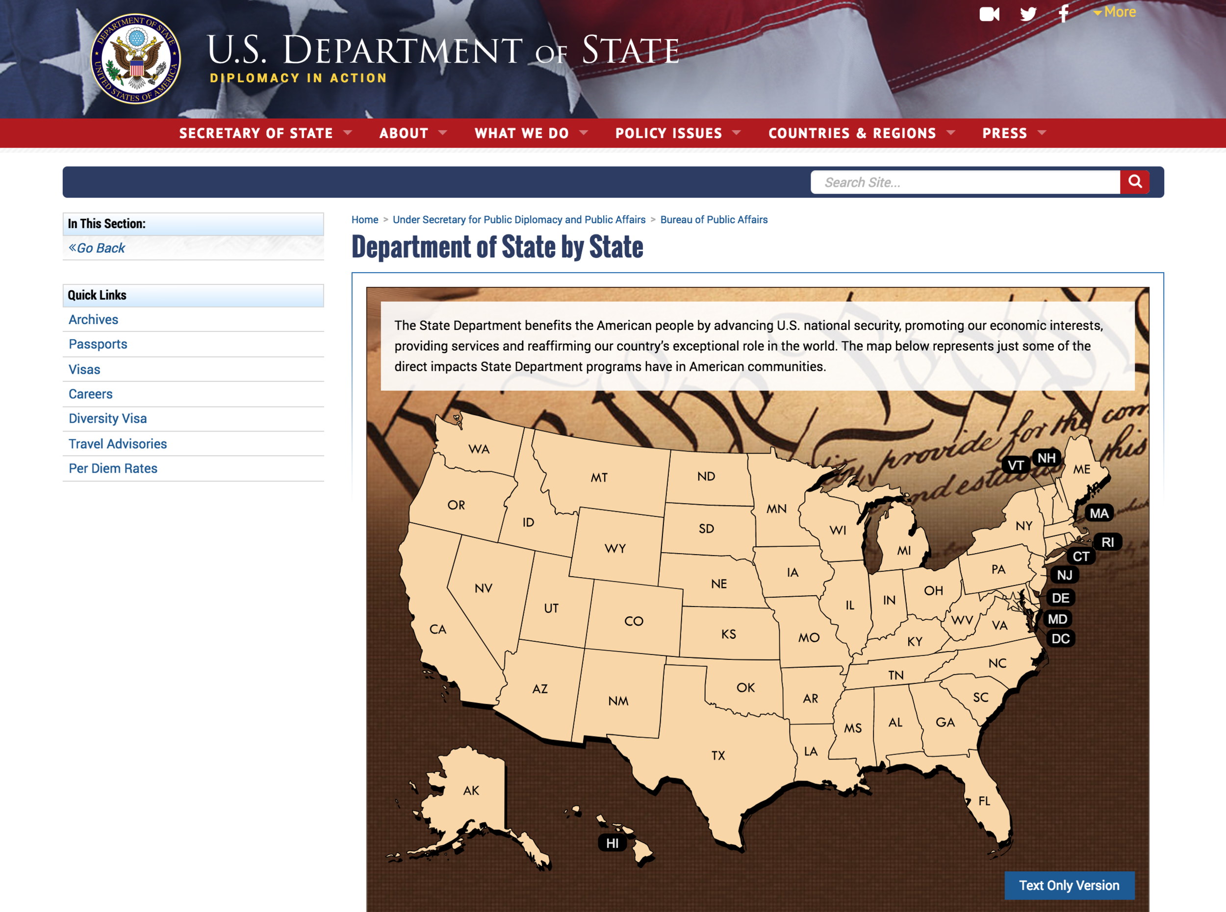
During my time as Civic Digital Fellowship Design Fellow at the Department of State, I worked on a number of different projects with the overarching goal of unifying and modernizing the State.gov website. One of my main focuses over the course of the summer was reimagining what is currently called the Department of State by State Map, a tool used to demonstrate the positive impact of the Department of State's work on American communities. It is updated on a yearly basis ahead of the State Department's budget proposal to Congress and was a highly visited page on the State.gov site with about 70,000 visits per year.
Our Process
Although it was an important tool on the original State.gov site, the State by State Map was not within the scope of the core State.gov redesign project taken on by Huge Inc, the design studio developing a Wordpress theme and core style guide for the new site. Therefore, it was a high-priority project for the State.gov fellows team to focus on over the summer.
Research
From even a quick analysis of the original State by State Map, it was clear there was a lot of room for improvement. The tool was visually misaligned with the rest of the site, confusing to navigate, and contained overwhelming amounts of content for each state. However, before we started making changes, my three teammates and I wanted to step back and learn more about the purpose and audience of the page.
We examined the analytics of the current page, which helped us learned more about how users were getting to and spending time on the page. We also spoke with the Public Affairs team that updates the map every year, who helped clarify its purpose and use cases. These discussions helped us realize the core audience was really two separate groups with significantly different needs. The researchers, a group that included people like Congressional staffers and diplomats, needed the tool to find out more about specific programs and statistics about the State Department's impact on their constituents for things like budget proposals and speeches. The citizen audience, on the other hand, typically wanted a better general understanding of what the State Department does for Americans and how they benefit from these programs.

The original map included a key listing data categories and contributing bureaus. However, it was impossible to look at this key once an individual state's data popup had opened.

State data in the original map was hard to navigate, lacking in hierarchy, and overwhelimingly long.
Our conversations with the Public Affairs team also provided insight into the process of compiling the map. Currently, new data points for all 50 states were collected over email from 30+ Bureaus every year and compiled in a Microsoft Word document where they were lightly copyedited by the Public Affairs staff. Once all the Bureaus submissions were collected—which often required chasing down individual contributors—entries were categorized under the labels Jobs and Diplomacy, Education, Partnerships, or Travel and Security and moved into the Waterfall CMS system to be published as part of the yearly update. After publication, however, several iterations of corrections were often needed, requiring staff to navigate through largely unordered, unstructured content. Learning more about this process realized that not just the visual design but the entire workflow for creating the map would have to be reexamined in order to make the tool most useful.
Finally, we had a chance to talk with some of the tools current users. One of the most useful conversations was with the State Department's external relations advisor, who frequently interfaced with Congress on behalf of the State Department. He helped us determine what content was most important from a legislator and representative perspective and provided feedback on our initial concepts for structuring the page. He also encouraged us to keep statistics associated with their specific Bureaus, as the Congressional budget delineates funding per Bureau and this distinction helped the audience to know who to contact for further information.

Organizing quantitative data points across states. Highlighted categories were to be shown as featured data points in the impact map.
Concepting
We started our redesign by thoroughly analyzing the content for four distinct states—Alaska, California, Kansas, Maine—which gave us a better grasp on how the current content could be refined. This exercise also helped us derive more appropriate data groupings, addressing some indistinguishability between divisions like Partnerships and Education and utilizing categories more easily understood by the public.
With these state's statistics reorganized, we began to explore different ways to display the data, including removing the U.S. map completely in favor of a dashboard or an interactive quiz that would lead visitors to relevant data points. In the end, however, we determined that maintaining the map as the key navigational element was the best concept to move forward with.

After early feedback, I refined the team’s sketched out concepts into our initial wireframes.
Prototyping and Refining Design
After getting feedback on our concept sketches and zeroing in on this idea, I took on the task of developing mockups for the new site. This required integrating our ideas for the tool with the design system created by Huge, including finding ways to incorporate the various section modules they had developed for other State.gov templates into our design.
Our sift through the map’s content had revealed that many of the statistics in the yearly update were quantitative data points, which helped us pursue the idea of highlighting some of the high-level impact metrics around job creation, exchange programs funded, and passports issued across the United States. We also decided to aggregate these statistics into a big picture US overview that would serve as the initial landing page state for the map and give viewers an idea of the State Department's country-wide impact as well as its state-specific initiatives.

An early coded prototype of our reimagined Domestic Impact Map.

Wireframe for the new Domestic Impact Map and citizen resources list.
In order to address the differing audience needs, we decided to only show a condensed highlight list of state impact information on the main page for the tool and then link off to a state page with the full listing for those who were looking to do more in depth research. We also wanted to make the page more engaging and integrated with the rest of the site and came up with the idea of adding a list of State Department services, opportunities, and resources for individual citizens that people could use to explore State Department offerings further after reading about them in the state highlights.
At the same time, my teammate Rachel developed a new process for submitting and reviewing information, including compiling a detailed writing guide to share with the various bureau representatives collecting their department’s impact highlights. This guide will help individual contributors understand which information should and should not be included in their submissions and created more cohesive, plainly-written data points for the information being shared with the public. As part of this process, we also came up with a new name for the redesigned tool as feedback from users unfamiliar with the map had made it clear that State by State map didn't reveal much about what the page contained. Our new title, The Domestic Impact Map, made the information showcased by the tool more clear.
Feedback and Dev Handoff
After getting feedback from the State.gov team and Huge and refining our designs to address their concerns, my teammates Cleo and Omar started coding the custom parts of the page and creating a technical plan to integrate our designs with the Wordpress theme developed by Huge.
The new map starts by providing an overview of the State Department’s role domestically and context to the map. This is followed by the newly styled Domestic Impact Map where users can explore high-level impact numbers for the U.S. holistically or for specific states. Below the map, three high-impact bullet points of content are featured by category and users are given the option to explore the full listing of impact statistics on the state's impact page. The overview page also personalizes the work of Department of State by featuring links to actionable info on careers, travel and exchanges and allows readers to do further research on specific topics of interest though a related content module.


Impact
Because of our work on this project, State.gov was able to launch a modern, interactive, and informative tool about the State Department's impact on American communities. Bureaus now have a writing guide that sets a standard for powerful, relevant content and saves the Public Affairs team time providing feedback and copywriting content. Congressional staff and representatives at all levels will have a convenient way to learn and to disseminate valuable information about the impact of Department of State at home while citizens will also be able to engage with relevant impact metrics and learn more about State Department services available to them.